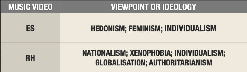
radiohead - ethnocentrism, internationalism (promoting)
capitalism- adverts
hedonism- doing things because it feels good.
Hedonism- they do include it in the mv but they go against it and showing that its bad.
Xenophobia- the fear of strangers and foreigners
they use this to send the message to wake people up since it was happening around that time and no one did anything.
Authoritarianism- they use this in the mv with the tomato workers and how when the farmer raises his stick they start waving at his comand.
burn the witch- there is no new equilibrium showing that nothing changed and it will repeat. Equilibrium the village, disruption the investigator, recognition burning him.
radiohead- their message is more important than their actual image, politically left-wing educated.
Value transference.
Radiohead- How does it use traditionally positive stereotype to show xenophobia?
They use traditionally positive stereotypes through mise en scene with the villagers have quite traditional rural clothing which really portrays the investigator as an outsider with him in a suit. They all act really friendly with him waving and them showing him around and what might seem innocent at first turns quite disturbing. They don't show the xenophobia through the expressions of the villagers but their actions near the end of the mv when they watch him burn while waving at us, which links to the context of what was happening at that time with the immigrant crisis and people fearing them also the muslims being viewed negatively.
audience
_______________________________________
Thursday 11th January 2024
Questions
L/O: To explore possible questions and structuring exam style answers.
Mv question is a 10 mark one not the 15.
Top band of the mark scheme.
-Detailed and accurate knowledge and understanding of how and why the specific area is used in mv
-Clear and precise and balanced explanations of the use of the specific area, in my chosen mv
-Supported by detailed and accurate reference to one of the set music video.
really detailed about the references intertextuality
clear and precise understanding of the mv
accurate technology
Structure:
1) Think about the Big answer - think about mv as a general ( a couple sentences)
Outline the context of the mv, link the Q
2)Select and explain specific evidence from the video that proves your point
3)select and explain specific evidence from the video that proves your point
4) select and explain specific evidence from the video that proves your point.
Explain how does media language help to understand social and cultural context? Refer to one of you music videos.
Media language can help us understand social and cultural context in music videos through how the artists decided to make the visuals in the music video. Which makes it easier for them to portray their views on the contexts and also what the message they want to give to their target audience in general. Since Heaven by Emile was her debut song it shows that she's a religious person and also wants to send a message across with the music video which supports her lyrics.
With the cultural context, we can clearly see the religious believes throughout the whole music video with short clips of close ups of the crops with the cross, the statue of an angel, the churches. Which could show the upbringing of the artist with a religious family or can be targeted to her audience that may have similar backstories. The long shot at the beginning with the girl in the red dress going down the stairs portrays the sin of lust with the red dress and her going into darkness and falling into the temptation.This shows the binary opposites of good and evil which is what Levi Strauss talks about. Another scene which shows the religious belief is when the artist Emile is near the tunnel looking at a dude with an over the shoulder shot to show the dude and then cuts to her inn a close up which looks like she's looking at him. Then later near the end she turns away from him which looks like she knows what his dealing with and could probably have done it in the past but now she's a different person and is going the right way.
The social context can be seen, through the teenagers shown in the music video throughout the mv. We can see a mid-shot of a guy smoking but not looking happy with his decisions.
Not finished in 20 mins.
Friday 12 January 2024
Theory
L/O: To explore including theory in our exam answers.
Barthes - connotations ( the red crosses on the doors relates to the burning of the houses and also the plague. Seesaw being innocent and then turns out it is a dunking stool which has very different connotations and being darker.) (SE the girl with the red dress and the crosses with the religion)
Todorov - narratology (RH) (at the beginning the birds singing which gives a nice calming vibe but at the end they are still singing even after all the things we have seen and it doesn't give the same feeling, more like nothing will change.)
Butler - gender performance ( RH woman baking feminine clothing, men doing the more harder work. only the woman were putting flowers on the noose to making pretty) ( SE the teenagers being more rebellious and smoking also the dude under the bridge which looks like he's waiting for something.)
Strauss - Structuralism (ES,RH) (RH at the beginning a very normal rural village and near the end they are burning him alive. christian values and the rituals)(SE the idea of temptation and trying to be good which can be seen throughout the mv with the religious element. High and low lighting to represent the good and bad.)
Baudriallard - postmodernism (RH) ( the intertextuality throughout the mv, with the wicker man and the ritual/ burning the person alive, the lord of the flies with the pub name, hot fuzz with the model village.)
Gilroy - post- colonial (SE) ( who's view is it of London.)

_________________________________________________________________
Thursday 18th January 2024
Advertising
L/O: To understand the purpose of advertising and the language used to analyse text.
red - lust
facial expression/ dress, a lot of red
words 'hypnotic poison and christian'
Advertising
-AIDA
used to hook audience's attention.
- Attention
- Interest
- Desire
- Action
-On the dress out of milk, unusualness without the cow, simple colour palette
-Text and the slogan.
-TA of women from the slogan but male gaze cause of the woman them selfs.
-Get the milk
Gillette
Layout - close up of the man. Full shot of the product in the corner. (Z pattern layout)
Typography- Bold serif black writing on his face, rock heavy metal. Also bold white sans serif near the product which is the same as the logos typeface. Block capitals masculine.
Language - direct address, precision which shows they are better. Links with brand
Imagery/ mise en scene- Deified man with the cheekbones man which shows it for men and also its a eraser product. Central main focus. Lever jacket, tough, masculine, rock.
Colour - dark colours except the product with the orange stands out more. Shows mature and masculine side which emphasises the face and rock genre.
Slogan/ Brand - 'The best a man can be' TA for men.
Advertising Genres that we are looking at.
-Baby products advertising
- Fashion advertising
- Charity advertising
Friday 19th January 2024
Advertising
L/O: To explore techniques for analysing adverts effectively.
Analysis Structure:PEEL paragraph- point, evidence, explain, link.
The lynx Effect is the brands name in the bottom right.
Click the mew fragrance is the product which we see in the mans hand with the number 1930. Close up of the mans face.
HoneyMania Body butter advert:
Mid long shot of a woman touching her body with also wet hair which links to the body butter product that we see at the bottom right. There's a transparent honeycomb edited above her body. The brands name in the top corner. Colour palette links to the product . The lexis used shows that this product is for woman along with the photo.
The representation of gender can be seen with the mid long shot of the woman not really wearing anything which links to the product being a body butter. She seems to be in her 20s which could link to the brands target audience for this advert since younger woman would most likely buy the product.
Levi's advert:
A monochrome close up shot of a man with dirty and messy hair which shows he's been through something. Which links with the typography used being personal with the handwriten font. Which links to the overall image of Levi's making the cloths just for you. The brands name and slogan in the top right corner. The brands name also stand out more since its bright red while the photo is in black and white.
The representation of age and gender can be seen with the young man in the main image. Which shows a positive representation of men as strong in body and spirit.
Hestia advert:
A monochrome close up of a man which makes the blue text stand out more with the blue.
The representation of age can be seen with this middle aged man that looks like a wise man.
Thursday 25th January 2024
DIRT
L/O: To reflect and improve on analytical structure and content.
The edited gold eyes are looking very intense at the camera and also with the raised eyebrows her expression seems very serious and dangerous. Her eyes also link to the products name' Hypnotic Poison' since it looks like she's trying to hypnotise you. Also the 'poison' links with the colour palette of red and black which connotes danger and death.
Friday 26th January 2024
Representation
L/O: To explore how representation are constructed
CAGEDS
Class
Age
Gender
Ethnicity
Disability
Sexuality
Exam set text
Dove : Beautifully real mum
River Island: Smooth Moves Only
Shelter: A home for everyone
Thursday 1st February 2024
Analysis and Context.
L/O: To analyse context and media language in the Dove advert.
Dove:
sells the product with an almost awareness technique by showing real people which is their brand recognition.
River Island:
showing people with disabilities and different race.
Shelter:
Awareness not selling.
Research and context:
Overview of Brand/ Organisation-
Dove- about real beauty as a source of confidence.
River Island- They make fashion for real people with real lives, who want to look real good. Because life's a celebration- let's dress for it.
Brand image and values-
Dove Values- They care about all woman and want to create a positive beauty standards.
River Island- They are inspired by the latest trends and our heritage style archives, we've been serving style.
Previous advertisement campaigns-
Show us real beauty- woman and non- binary people from around the world redefining beauty on their own terms.
Star vehicles: rep and values-
River Island-
Advertising campaign context-
Social context (UK) - In 2011 a lot of riots happened in London
Dove notes:
Campaign for real beauty in 2004. The campaign was about embracing and celebrating differences.
The aim was to empower woman and
Campaign objectives:
- To sell the brand to mothers
- To launch that product
- To empower mothers
- To unite women on their journey through parenthood
- To enable ' real people' to see themselves represented in advertisement.
- To challenge seemingly 'perfect' images of woman and ' picture perfect' babies and young.
Shot type - Wide mid shot so we can see a bit of the mess on the table, and the mum looking shocked at her kid. This links with the real life message and how this is completely normal and that mums don't have to be perfect. Everything is in deep focus where everything is in focus to really show the reality and not hide everything by showing everything to really portray the real life and personalises.
Slogan- Real life, Real beauty - Reinforces that even with the messy kids and the mum in comfy cloths we can still see the beauty in it. And also that this is real life and no one is perfect and thats okay. Repetition of the word 'real' which links with their campaign.
Typeface- The typeface matches the brands identity so its more recognisable. Bold sans serif font which is simple and effective typeface and more modern. Now this font is more neutral and the bolder it is the more masculine and the thinner the more feminine but it also depend of the style of it since there are so many sans-serif now that it doesn't just depend on serif or sans. The logo is a script font which looks handwritten which personalises the brand.
Costume- There isn't any just normal cloths that people wear at home which links with the real life. She isn't wearing any makeup or has her hair done which really shows the realism.
Hashtag- '#Beautifullyrealmums' this links with the campaign and the message that they want to spread that being a mum is hard and messy but it doesn't make it any less beautiful. And encourages interaction to share and post about it to spread the message. Its in the bottom right which links with the 'Z' layout so its the last thing you see, so the people remember the brand, slogan but also the hashtag since its the first and last thing you see. The hashtag used really shows the change in advertisement and spreading the message and sharing their own experiences, which makes a trend and help them go global reach for Dove. For the woman doing this it would help create a sense of unity for the mothers.
Lifestyle- That being a mother isn't an easy job which we can see with the kids having fun making a mess and the mothers shocked expression while holding a baby and that this is completely normal and that there is no 'perfect' kid or mum. The mums can also relate more to the advert since they are showing how parenthood is actually like messy and tiring and that would make the mothers feel heard and appreciated. Normally the lifestyles shown are very privileged and luxurious which this advert challenges and makes it seem very normal. Which also matches their brand identity with
Logo- Logo is next to the slogan and quite small which means that the main focus is on the image rather than the brand itself. Since they are very recognisable they don't need to show any products and just their logo.
Location- Probably their house in the kitchen. Which would appeal the the TA since this is in a normal setting and not a studio, this would make it more relatable due to the kids making a mess in the kitchen. Adds the realism to it but also reinforces the stereotypes of mothers being in the kitchen with kids.
Product?- Reinforces the lifestyle rather than selling a product
Anchorage- The slogan links with the image 'real life, real beauty' about that this is real life and not an edited perfect mother with kids. And since even in the mess the kids make and the normal clothing that they are wearing they are still beautiful due to them being them selfs and that what is real is beautiful. But its the world 'real' that really anchors with the image and the lifestyle they want to show.
Colour Palette- low key colours, main focus on the people due to their shirts standing out from the background colours. Saturated colours but still have the natural colours pop so it still has the element of real life
Beauty Appeal- Reinforces the beauty of real life and natural beauty with no makeup or anything.
Persuasive language- Subverts the conventions of normal advertisements with the challenges elements. The repetition of the word 'real' to add realism. The adjective 'beautifully' puts a positive image on mothers and feel appreciated of being represented.
Representation:
Who/ what is being represented?
Class- middle class- with the kitchen and a full fridge. This kind of chaos being represented for a middle class rather than working/ lower is unusual.
Age- 30s
Gender- female mom- positive representation of a caring mother and real mother hood. Family life as well. A challenge to the advertisement world of mothers.
Ethnicity- asian- positive representation of a Asian family in the kitchen. They seem to be less represented in western adverts which challenges the dominant white representations in beauty adverts.
Is the representation positive/ negative?
Positive which links with the campaign and showing realism. The kids making a mess and the mother looking stressed.
Are stereotypes used?
Mother and kids in the kitchen, father probably at work. The normal stereotypes of mother hood is always shown as perfect and calm, kids as well. This challenges them stereotypes with chaos and stressed mother trying to calm the child. The representation of children reinforces that the girls are just doing their things while the boy is energetic. The woman to this day are the main care taker.
How is media language used to construct the representation?
Wide mid shot of the family in the kitchen with the kid making a mess.
Saturated colours but the natural colours kept the same to reinforce the realism and the message they are trying to convey with the campaign.
Ideologies and Values:
Consumerism- The fridge is full, its an advert that are used to sell stuff. Any advert will promote consumerism.
Celebrity culture- there isn't any which challenges the dominant celebrity culture online.
Multiculturalism- asian community often under-represented in the beauty industry.
Feminism- Shows positive representations of real mothers and motherhood which is represented due to the TA being woman. And challenges the stereotypes of woman being perfect.
Context:
it came out in 2019. There were stereotypical views of mothers at the time since they are challenges. Probably at home not having to work, glamourised look perfect, happy all the time and not exhausted, worried. Culture context -Celebrity culture impact of motherhood, due to them being more perfect.
Millennials would of been the mothers they were targeting at the time. Millennials were the first generation of digital native since they grew up with technology. And therefore they were constantly subjected with celebrities and body image and what beauty is, more so than previous generations of mothers. And the influence of how mothers are and picture perfect families. There was a survey that millennials mothers where pressured to be perfect. Since Doves campaign there has been a lot more counter culture podcast and about motherhood. On social context the men are rarely shown in these adds due to it being targeted at mothers rather than men. Also woman are the primary care giver so they would be at home taking care of kids. It could also show single parents.
Friday 9th February 2024
Analysis and Context
L/O: To analysis context and media language in the river island advert.
The 'Labels are for clothes' campaign their are a diverse campaign that features people of varying ages, gender, ethnicity ...
Their aim is to challenge social and global stereotypes by featuring under and often misrepresented group.
RI wanted to show that clothes are for everyone and this is arguably one of their most inclusive campaign up to date. Subsequently, RI collaborated with anti-bulling charity 'Ditch the label'.
Campaign objectives:
-To challenge outdated stereotypes
-To promote inclusivity and diversity
-To celebrate individuality and not define individuality by their ability or stereotypes
-To sell more clothes.
Shot type- mid long shot, we can see that he's in a wheelchair which links with their inclusivity of the campaign. Which shows the clothing which shows the product.
Slogan- 'smooth moves only' This is the models slogan rather than a brands. The clothes would be really well fitting and also they look classy. The wheelchair as well with the rolling and being smooth. And effectively moving through life. This also links with him being french and romantic and them being quite smooth people. Very positive.
Typeface- Bold sans serif font which is more modern not showing any genders but also easy to read. It also looks smooth in a way.
Costume- I think he's wearing clothes from the brand to promote their clothes and that it fits anyone. Slick and casual which also links with the smooth with the clothes material looking smooth. And that fashion has no restrictions.
Hashtag- 'Labels are for clothes' which links to their campaign and also they want to share this message with the hashtag and interactions online. They are encouraging the inclusivity. They are hoping people are more comfortable with them selfs and digital natives encourages that
Lifestyle- Their clothes are for everyone and everyone can be fashionable with no restrictions.
Logo- Their logo looks like a river with the R line connecting to the I. Also its quite big but the focus isn't really on the logo and more on the person and the slogan. They don't really need their logo on there and underneath the logo there is their website since people shop online more often.
Location- Looks like a studio with a dark red background. Emphasis on the model and clothes.
Product- The clothes he's are wearing.
Anchorage- the anchorage would be the 'smooth moves only' which would link with their photo and the inclusivity they show. Which emphasises the inclusivity along with the hashtag.
Composition and Layout- The logo are on the lower bit since its the last thing we see. He's also positioned in the middle which makes him important. He's eyes are in the top third which is direct address looking at us
Colour palette- Red colour palette which links with the romance and the gold contrast it since its showing status and wealth and luxurious.
Beauty appeal- Natural beauty and positive representations of him and his disability. He's also a good looking dude and he looks kind. He genuinely looks happy. Its still in the fashion industry which means they need to look good.
Persuasive lang-
Representations:
Who/ what is being represented?
A French disabled man in a wheelchair.
Positive or Negative?
Positive representations
Are Stereotypes used?
Yes we have the wine red colour in the background which links with romance and wine which is from the French. also him being french and their representations as good looking people also smiley and happy.
How is media lang used to construct the representation?
The shot type and position in being in the middle which shows his importance. Disabilities are normally not represented, if they are they are inferior and weak. In the fashion industry they are absent. However they are represented here and shown in a positive light and he is also a pro athlete and this shows the positive of them two. He is well put together and happy with a smily with the eye contact which is direct address. Men and nationality being French with a tan. This is a global brand and their fashion in France. This celebrates Nationality.
Thursday 22nd February 2024
Analysis and Context
Ideologies and values:
consumerism- promoting clothes to buy clothes.
Celebrity culture- models, Jordan Luce athlete.
ableism- using him to target men and disabled people. liberal and progressive.
individualism- they are all different and their own individual.
multiculturalism- different ethnicities shown in the campaign.
Context:
2018.
They were not all celebrities and if they were they weren't main stream. Societies views have evolved and more diverse in all areas. Millennials are digital natives we can see this with the millennials in the add and also the hashtag and its centred which is an important part in their campaign and their TA. They want it to share it around and also challenging the celebrity culture and also the society norms, which they challenge the pressure of how you don't have to be perfect in body image, and focuses on the real.
Analysis and Context - Shelter advert.
L/O: To analyse context and codes and conventions in the shelter advert.
desensitisation- when you see things all the time that it doesn't phase you anymore.
Charity Campaign-
- donations
- raising awareness
- shared values and sense of responsibility
typical conventions
emotional - this child, or name the child,
what can you do - empowers the audience
direct address - close up on faces, washed out colours/ monochrome.
contact details so you can reach out to help.
Imperative - now
constructive meaning:
-messages about suffering closer to home and culture. We may emphasise more and understand.
-Equality there may be a sense that we believe that we have had our own issues and sort them out. And we might fail to see the problems as ones that require help.
Target audience:
Their target who are not homeless but people that might lose their home for whatever reason and give help to them.
They knew that they weren't reaching out to those that offer help due to lack of awareness.
Campaign aims-
Created by Amplify and produced on a pro-bono basis(for free).
Difference between charity adverts and commercial.
The difference between charity and commercial adverts is their aim one wants to spread awareness and help others in need the other is more consumerism based. The use of persuasive language is that in a charity advert they are not subtle with their direct address and really emphasises it so that people reach out, whereas in a commercial ad they are more subtle with it through the lexis used but its still there so that the audience reaches out to buy the product. The style is more desaturated in colour palette or even monochrome, for the audience to focus more on the message rather than the bright colours whereas the commercial has more saturated colours to catch the audiences attention and stand out. Also the layout is different, there is no product in the charity and focuses more on their message across, where as the commercial has a product.
Campaign media lang:
Shot type- big close up focuses more on their expression, direct address through looking straight at the camera. Focuses on the eyes, proximity, empathy and melachony of the expressions of sadness.
Slogan- 'We can help', reassurance, inclusive and link with togetherness, more personalised.
typeface- block capital sans serif font, emphasises the situation in need of help. Connotes with homelessness has a big impact,
text/lexis- Direct address, to feel more connected with the audience.
lifestyle- people that are struggling to keep their houses. It can be
logo- in the bottom right corner, thin sans serif font. The H looks like a house which links with their values.
anchorage- The big red text which emphases the broad situations that they can help with, along with the white text which explains more.
composition and layout- Central triangle shaped layout. With the bold important text at the top and the logo in the bottom right corner, with their website in the other corner. The website to donate and interact with them, for support or to help. A search bar to tell us what to search, which links with the millennials that are digital natives.
colour palette- red and black colour palette, Black connotations of misery whereas red is danger and awareness.
persuasive language- Direct address used in the white text, then personalisation used with the red which others might relate to. Rhetorical question gets the audience to consider their circumstances. Personification to get you to put through their situation 'we' 'you' 'i'. This can happen to anyone, different ethnicity which creates the idea of fear as a persuasive technique.
genre conventions of charity ads- contact information, direct address. colour palette desaturated, close shots of individuals.
Friday 23rd February 2024
Representation
L/O: To analyse representations and ideologies in the shelter advert.
Who/ what is being represented?
Three different people that might lose their house. They are people who are at risk of homelessness.
Representation positive or negative?
Negative representation of the situation their in and challenges charity ads where there is no hope and extreme. With a diverse representations which shows its a diverse issue. Positive representations that there is hope for them and help them selfs through the help and support of shelter,.
Stereotypes used?
Big close up of their faces is stereotypically used in charity adds to create empathy , however with shelter they look put together and not your stereotypical homeless person.
How is media lang used to construct the representation?
The use of direct address and big close up emphasises their situation.
Values and Ideology:
Social duty-
Social liberal view, and reinforces the idea of the duty that we can help those that are in need if we can
Social inequality-
How social inequality is unjust which features the inequality of different people. Individuals and families that are struggling with the inequality in society, and this effects people you might not think.
Stereotypes-
Charity ads make homelessness looks really extreme and gives a bad reputation or misrepresented, there can still be hope for them but they make it seem like there isn't not without their help.They are white, mostly men, addiction issues, lazy/jobless. They normally blame the individuals if they are adults not so much kids. Whereas with shelter they offer it and don't make it extreme cause they do have hope even without them they can look at other places and spreads that awareness for the people that might lose their home for different reasons. They aren't blamed and it can happen to anyone for different reasons.
Individualism-
They are suggesting that the individuals can help them selfs and the values of individuals. And they have the right to make their situation better and righten themselves.
Context:
One main image and one bit of text with the convertible values. The fact they are using it means that its easily recognised among commercial adverts. The context is that these issues where a lot of social inequality and there was a housing crisis.
There were a lot of technological convergence with the web link and the search bars that we were on the internet.
Thursday 29th February 2024
Exam Format
L/O: To analyse representation and media language in similar adverts.
2 questoins
q5 is 10 marks -17 minutes (knowladge and understanding) (explain) 3 paragraph
q6 is 15 marks - 25 minutes (indepth analysing) (unseen advert) (judgement and opinions) or comparason (unseen and what i know)
Fashion print adverts: codes and conventions
models, mid to long shot to show the products, the brands name is the last thing you see, mainly females depends on the brand. able people. extreme long shot if theres more people. single model centre, sans serif font unless its a brand identity, colour palette is based on the clothes, one black colour background. Middle and above due to the high fashion. Thin shaped body type, flawless faces mixed ethnicity, unrepresented older, larger people, disabled.
Beauty print adverts: codes and conventions
Flawless skin, the product is seen, colour palette is bright colours/ natural/ muted tones, use of celebrity recognition. High key lighting to draw attention to the face, not many shadows since it ages people. Stereotypically attractive 20s females. Ethnicity not perticually diverse, unless its a product specifically for other enthicity, the product is shown, clean layout, simple colour palette its also based on the product or packaging.
Charity print adverts: codes and conventions
monochrome/ desaturated colours, close up of desperate people, kids and older men are shown more, very extreme, empathy, direct address. Despair, our duty.
Friday 1st March 2024
Exam Structure
L/O: To structure effective exam response.
The colour palette is mainly blue which connotes the stereotypical masculine colour.
The representation of a black female singer for celebrity in a anti sexual violence charity adverts shows that this issue can happen to any woman famous or not. It also focuses mainly black woman due to other ethnicities and other ages being under represented in this advert but they are showing un represented ethnicity in a more positive light as a survivor. They are showing a adult female which means that this could of happened to her when she was younger which links with ' bear the scars'. The typography of script fonts on her face shows a more personal view of the situation and the highlight on 'myself' shows personification that this is real and that this is reality. The logo in the bottom corner as well as the website mention shows that they want females to reach out. This type of violence is mainly related with certain ethnicity and cultures and rather not really happen to the white female but mainly to the other ethnicity which is why this female was used.
3-4 paragraph

Thursday 7th March 2024
Exam Questions
1) Analyse how the Simon On the Street advertisement (source c) conveys values, attitudes and beliefs about homelessness.
Your answer must:
- consider how media representations convey values, attitudes and beliefs in source c
- make judgements and reach conclusions on how audiences may respond to and interpret these media representations.
The representations used to convey values and attitudes and beliefs about homelessness are shown through media language and also the lexis.
We can see that through the use of camerawork there is a close up of the set up for the QR codes, which introduces the audience to the charity attitudes and also identity. We see a stereotypical use of the blankets, bags and plastic bottles to clearly show that this is about homeless people; they also have the QR code for the audience and people to interact and spread awareness for anonymous homeless people and also that there are different ways to help them. Then we have different long shots and different angles to show that people are interacting and also the spread of awareness which is one of the controversial charity adverts values. But with the long shots we see that these QR codes are in a bunch of different locations which could suggest that this is a big charity that can help people on a larger scale. The QR codes also suggest that the audience has a level of technical knowledge.
In the lexis and typography used we can see the attitudes and beliefs of the charity. The use of emotive language which engages with the audience is evident in the text box of the advert. They probably did this approach since it is different from the normal charity adverts that are more extreme and more direct but this one is more calmer while still talking about a serious topic but understanding the worries of some people that might want to donate to a homeless person on the streets. They also informed the audience of where to donate and what that money would do, which further shows that they want the audience to engage. The sans- serif font is used because it is more modern but also easier to read. They could have used it because it is more modern to emphasise that this is still a modern time issue and that this is happening still. The bold rough font of the title of the charity advert draws attention to it but it also reminds me of the streets the font its rough which could be associated with street life and the struggles, the bold font in white could suggest that this is a big issue. Lastly the lexis itself 'Simon on the streets' it uses a name which personifies the advert to a homeless individual, which is a charity convention value that a lot of charities use in their adverts to persuade the audience.
In conclusion the audience are more likely to interact with the advert since while there are some similarities with the stereotypical portray of homeless people and the persuasive language the big difference is how the audience interact and also how they try to persuade them to interact and donate. The audience is more likely to interact since there is no guilt or fear used to persuade them and more reason with them and understanding them. The QR codes are very different since they normally use the actual people rather than have them anonymous. The use of the stereotypical homelessness is used to familiarise the audience that this is a charity for homeless people and nothing more, they don't make the audience show empathy or guilt to the homeless and feel responsible which is nice. Which is why i think this advert did well and that why i think the audience would interact. They could also interact because of genuine curiosity like ' why is there a QR code on the street?' and then they scan it. And that is how i think they used representations to convey values and attitudes and beliefs about homelessness.
Friday 8th March 2024
The Big Issue
L/O: To research institutions and ideologies behind case study product.
Magazines - Big Issues
Typography- depends on the genre
Mode of address and register-
Shot type and angle- low angle long shot but it does depend on the genre.
Colour palette- depends on the genre.
Composition and layout- they are all pretty much the same with a main image and everything.
2-3 colours
lots of cover lines
text around the image
glossy
big issue notes:
launched in 1991 tag line ' a hand up not hand out'
- social enterprise - benefit for society, non profit, starting in London and spread in the UK now gone international.
- street paper, same as newspaper and cheaper to make.
- Target audience a very diverse- vide variety on gender, age and race.
- To offer homeless people the opportunity to earn a legitimate income, thereby helping them to reintegrate into mainstream society.
- Strong social and political themes as well as entertainment coverage, creating a mix of heavy and light topics.
- £4 Vendors buy it for £ 1.50 and sell it to the public for £4 and they keep half and give the half back to the company.
- Following COVID, TBI can now be bought in some retailers and online through specific vendors. Now it has a bar code before it didn't.
-released every fortnight
Thursday 14th March 2024
Readers:
-be university educated
-interested in politics, popular and high culture (music, fashion, films/tv.)(literature, art, museum exhibitions.)
- Have a limited disposable income (middle class)
- be socially conscious.
Young at heart, educated and loyal. Slightly more woman than men, 60% of their readers are between 18-49. Liberal middle left.
ideologies and values:
- socially aware, helping people that have less than yourself, socialist viewpoint
- light hearted and serious topic which are balanced
- protest
-mental health
- bands and music popular culture
- culture on high and popular is important
- war
- rebellion, and wanting to understand others opinions ( self education)
- use celebrity culture with similar values, celebrities go to big issue not the other way around.
- diverse with topics and people, age, gender, ethnicity, the audience value being informed and valuing diversity and people.
- satire taking the mic of politics, high ground humour play on words, for the audience.
- value publications that have view points different from theirs.
- intertextuality of rebellions and standing up against dominant ideologies if they are not right.
Friday 15th March 2024
The Big Issue
L/O: To analyse big issue covers effective.
starter task:
- the mast head is split when its normally together, and around the image which would show that the image is the big issue, and also the tag line
- the cover lines are at the very top all the time
- the main cover line anchors the image which is a normal conventions.
- one central image is typical
- illustraited covers which is unusual to magazine covers. (cheaper, context)
- mode of address lang- educated tone address but not really formal, links with audience, direct- the image looking at you, I first person which we are getting her story
-intertextuality in illustrated
- puffs
- cover lines - don't display them in the normal way- more unique and interesting
- the use of colour is more important to them, to draw the audience for sales.
Masthead- split could also act as an charity logo
feature articles- takes up majority of cover illustrated image cost less
colour palette- different colours but have three main colours
puff- the size changes depends on the cover
Mode of address- how the text speak to the audience and involves them. it also refers how a text influence audience
- direct adress
- indirect mode of address- the model looks away, writing refers to people or audience
-you can have different modes of address- tones, formal informal, humorous
media producers are been to establish a relationship with their audience.
- mode of address will vary depending on the media form
The masthead is split and traps the image in between which suggests that the context in the image is the big issue. Along with the tagline. The main cover line is anchored to the main image and put inside the box which isolates the writing form everything else. The personification of the main cover line shows her side story of being disabled which would link with the intertextuality of recognising a wheel chair, and how we would understand what the text refers to when it says 'unseen'. We have one big image of the disabled woman in the centre, she isn't represented badly since her body language shows that she is confident, which would be challenging stereotypes along with the cover line lexis' urgent battle to make the unseen seen' which would educate the audience on this issue this also links with their ideologies of other people stories and rebellion of things that aren't right. The social and political context with the bloody Sunday cover line and how they are going to mention stories form peoples view, show the educational values of Big issue. The tone of the lexis is quite casual but educational, which would appeal to the audience since they are treated as an equal and also educated.
Thursday 21st March 2024
The Big Issue Constructing meeting
L/O: To analyse the use of intertextuality and multiple meanings.
starting task:
the theme and the main message?
about mental health and war/ remembrance day/ veterans
How is this shown?
the lexis of frontlines, the main image, the lexis in the main cover line, the poppy near the logo. redacted over the eyes (hidden) shows that their struggles of their lives after war and that its not finished. The hidden eyes show that this could be any soldier coming home.
the priminister in the front
trump being the bad guy
big ben and the white house behind it
The intertextual references with the ghost busters when they were females, and trump being the ghost which is the bad guy. We have intertextual references with the Hillary, Theresa, Taylor and Serena, which went against him and his views. Also behind Serena we see a tennis racket which shows that she is a tennis player, and that even the sports community is fighting against Trump. The White House being behind the Big Ben could suggest that Britain is better than America with their politics and views which also links with having Teresa May positioned at the front of the group, they are both very recognisable places. The lexis of the 'new female frontline' could suggest that these woman are the voices for other woman against men like Trump and standing up for them selfs. We have different ethnicities shown with the females, which shows that a lot of people are against Trumps views and politics. Serena Williams also played against Trump in a tennis game. Tump is represented as slimer which eats a lot of food, hes a funny character, he isnt to be taken seriously which is a normal representation of Trump.
Friday 22nd March 2024
Representation
L/O: To analyse the representations and ideologies constructed.
Ideologies:
value transference - other peoples values of the people on the covers that are good are shown good which means the Big Issues agrees with them. But if they are against their ideologies they will make a mic out of them (trump).
alternative to the main stream representations on Big issue covers, but help those that are minority or subverted people and show them so thats where it is different. Provides a platform for social issues that are of national and global importance. The B.I is a complex rep of possible challenge and support this seen in main stream magazines.
- Connotations of the pink shows love, kindness which would link to the death of the queen and how she was. Contrasts the black to be seen. Since its focus of her death the pink is more feminine and connects to her rather than Charles which links with respect.
- The photo has been chosen because the queen died and king Charles has been crowned as king. The show the change, and looks like they are going head to head with differences of opinions. Their heads are like they would be on their coins.
- The importance about the black background makes the queen and Charles stand out more and also emphasises the pink around it.
- The significance of the coverline and connotations of bright and green is linked to rebirth which would link to the coronation of the king. Also its a reference to his ideals of climate change and a better future, and ecology.
- The mast head is the colour black to show respect to the death of the queen with the mourning colours and the seriousness of the issue.
- 'Our vendors and the queen' the individuals that sell they are seen as united with the 'our' and includes the reader as well and how the queen affected them. They are showing respect but they bringing it back to the issue of homelessness.
- The queen looks more soft, while the king looks more happy. They both look human and very old, they emphasise their age through the gray. Charles is more bright the attention is on him since the queen is more contrasted with the shadows.
I think they are made to look funny because of the big heads and small bodies which links to the carry on reference. The titanic is also an intertextuality along with the carry on film which are about comedy and also links in with the Christmas in the banner. They are comparing the parties to a comedy film and the titanic which was a disaster which would represent how Britain is. The carry on films and titanic are both Britains history and culture.
The red and blue colours represent the conservative and labour parties. The blue is the conservative party and the red is the labour party. with the blue on top shows that their in power right.
Kiers face looks more serious, whereas the other one looks more goofy and unserious. Their heads could also suggest that they think they are right and being criticised. Bubble heads is linked to comedy. They are satirising both parties. Since you can see the vendor in the middle looking normal, also him being in the middle that the big issue stands in the middle, he is holding his land-yard like a referee would.
Three things that would appeal to the TA:
- the big oil gamble, he plans to get rid of petrol cars.
- the bins are related to him making people have seven bins.
- the train of HS2 which would have through 4 stations. he canceled it.
Thursday 18th April 2024
Media Language and Representation Exam Questions
L/O: To explore the exam questions and how to structure excellent responses.
positioning the audience- what opinions do they support. politically left wing, positive but anti stereotypical views on homelessness.
dirty, messy clothes, old man, helpless, worthless - stereotypical homeless people.
big answer- anti stereotypical views on homelessness- rep of man looks happy, clean- stereotypical is the dog, special edition box.
other points- race and ethnicity with sports, music, politics, tag line( supportive, socially responsible view)
main image:
tidy, clean man, happy and enjoying time with the dog 'bond' and 'love', showing love. The audience might relate to this since they might have a pet them selfs and emphasise to the bond. Urban background which shows the realism and reality of homelessness. The dog doesn't look homeless/ stray either he looks healthy.
Main cover line:
'companion' positive and friends, creates a more positive image through the lexis.
Mainstream topics, they like to learn and are interested, didn't expect to know, educated, socially aware.
Learn IT!!:
The Big issue attempts to position the audience to feel for the homeless.
It's about showing anti-stereotypical representations and viewpoints about homeless people that challenges the mainstream media.
Friday 19th April 2024
Media language and representation exam questions
L/O: To explore the exam questions and how to structure excellent responses.
1. The main way the big issue distributed used to sell was through vendors on the streets which is one to one, however they had to change this during covid and now they sell them online and in stores which means a broader selling. You can still buy the magazine online from the same vendor which you've got a personal connection to, to help them which still links with Big Issues goal of helping homeless people by giving them a job and earning money rather than handing out money to them, which links with their tagline ' hand up not hand out.' Which is more effective that they got more ways of distribution.
2. The shelter campaign compares to the traditional/ stereotypical representations of homelessness with supporting but challenges some their values, and goals. Since they aim to help people that have a home but are at high risk of losing it which is different from normal homeless charities. Whiles some of their values are the same to the traditional with them trying to inform and being a charity.
3. Artists like Radiohead chose not to appear in the music video because the focus is mainly on the message of the music video or it could also be because of the specific style of the music video, which burn the witch is a stop motion music video that focuses more on the narrative of the message its portraying. They are known for their messages they portray in their music videos rather than what they look like, which links with the style of their band.
part 2 media terms:
postmodern - burn the witch movement where draws attention to the intertextuality and is constructed/ created.
intertextuality - can also mean repeated media forms
ideologies
ethnocentrism
value transference- bands/ ads where you add a value to promote a message (burn the witch) values transferred to the band/ ads
xenophobia
stereotypes
connotations
BTW uses numerous intertextuality throughout like the Wicker man and Trumpton.
Homework:
Analyse how effective is the use of intertextuality in the River island and Nike adverts. in your answer you must:
- analyse the use of intertextuality in the two adverts
- make judgement and reach conclusions on the effectiveness of their use of intertextuality. [15 marks]
nike ideology: equality, change, sport and about individuals story, brand easy recognised, sports person Marcus Rashford
River island: change, equality, brand easy recognised, wheelchair sport person( Jordan Luce).
The intertextuality used in these two adds are very effective however there is a bit more in the River Island advert than the Nike one. They both have similar ideologies but the River Island one is a bit different since they aim to change the representations of normal stereotypes.
They both use known sport players in their ads Nike uses Marcus Rashford which is a football champion and RI uses a basketball player as their main focus. We have a monochrome wide shot of Marcus playing football which lets the audience focus more on him as well as the cover lines without being distracted by colours. Which also helps the audience focus more on the message and story of the football player and where he is from. The main cover line for the Nike advert really anchors it to the main image and also the change ideology. The Nike logo is easily recognisable which is why they don't have to but the brands name on there. Whereas, the River Island advert still uses a sports player which can be stereotypical however they are using the minority group of people.
NEA Blog link:
https://mariadragonea.blogspot.com/
Monday 27th January 2025
Media Language and representation exam questions
L/O: To revise the unit and its content.
Paper 1 section B
35%
Q5- 10marks- 17mins
Q6- 15marks- 25mins
Q5- 'explain' question, knowledge of understanding either on ML or Rep
mv
overall ml used
intertextuality and some examples
Q6- analyse question, make a judgement and have a conclusion.
knowledge
_________________________________________________________________
Friday 16th May 2025
Revision
L/O: To revise the unit and its content


MV CASE STUDY 1 NOTES:
ReplyDeleteSome great notes and insights. Well done. Make sure you link anything you notice to the meaning of the song.
MV CS1 REP Q:
WWW: good use of social context, supported by media language.
EBI: try including theory where relevant - e.g binary oppositions
MV CASE STUDY 2 NOTES:
Good - great ideas on intertextuality - make sure you link these to the CONTEXT.
MV EXAM Q:
WWW: good analysis supported by clear examples and accurate terminology!
EBI: makes sure each point is linked to a meaning or linked to context
ADVERTISING INTRO ANALYSIS:
A good start but you need to make sure you are linking the techniques used to the messages in the adverts. Where is lesson 2?